Thrive CSR
User Experience & User Interface Design
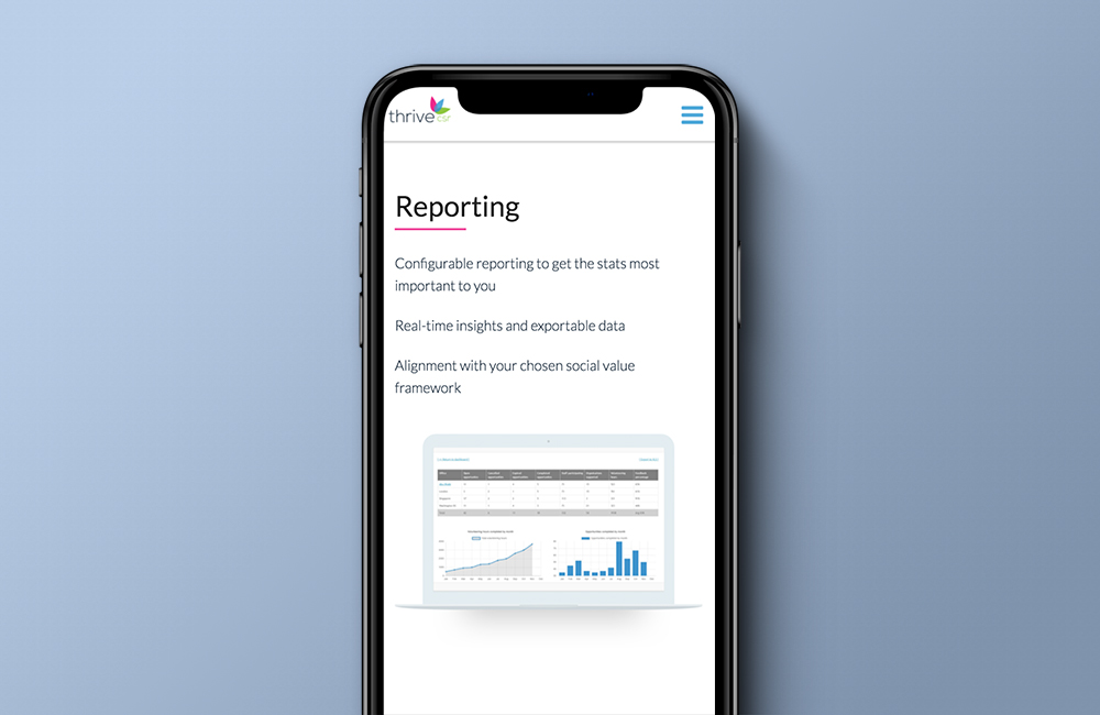
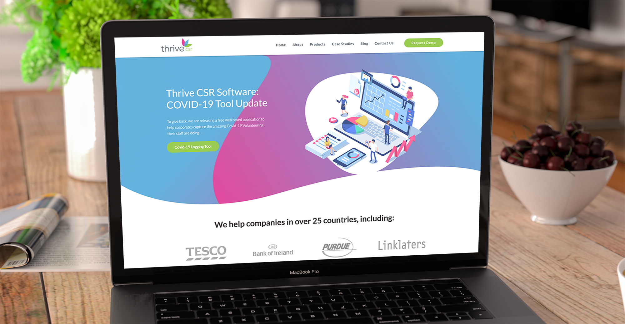
Thirve CSR approached me to redesign and rebuild their current wordpress theme. They felt their design at the time was very ‘off the self’ and they required a more intuitive and engaging aesthetic.
To establish who I was designing for I met with key stakeholders to gather requirements and understand the current user base. They had access to analytics on the old site so I was able to identify areas of key engagement and pinpoint sections that needed more traffic to encourage more conversions.
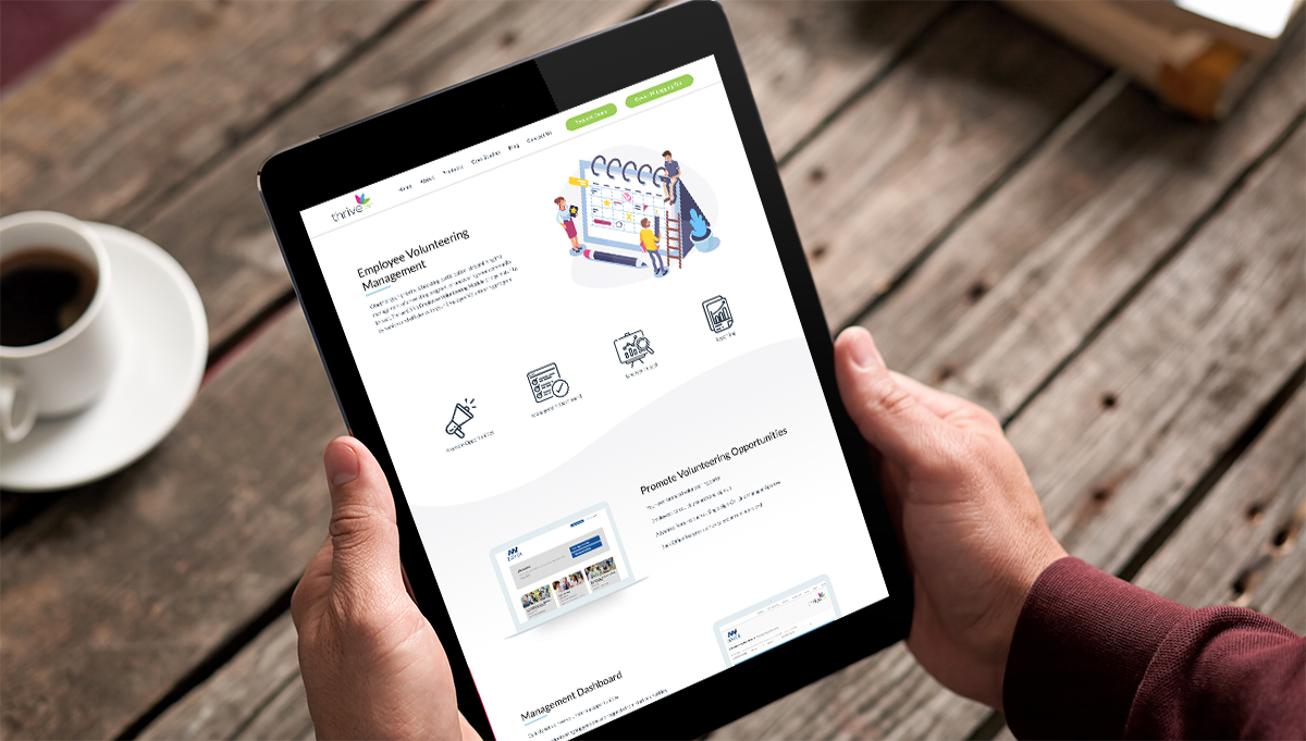
From discussions it was decided that using illustrated means to convey the products and their USPs would be better suited than using photography as this not met their budget with not having to seek out photography and environments to shoot but it also set them apart from the competition by having an identity of their own.
To ensure brand consistency throughout the design the vector illustrations used the core colour palette and worked within complementary colours. Subtle animations were also added to the interface to add another layer of delight for the user as they progressed through the content.
