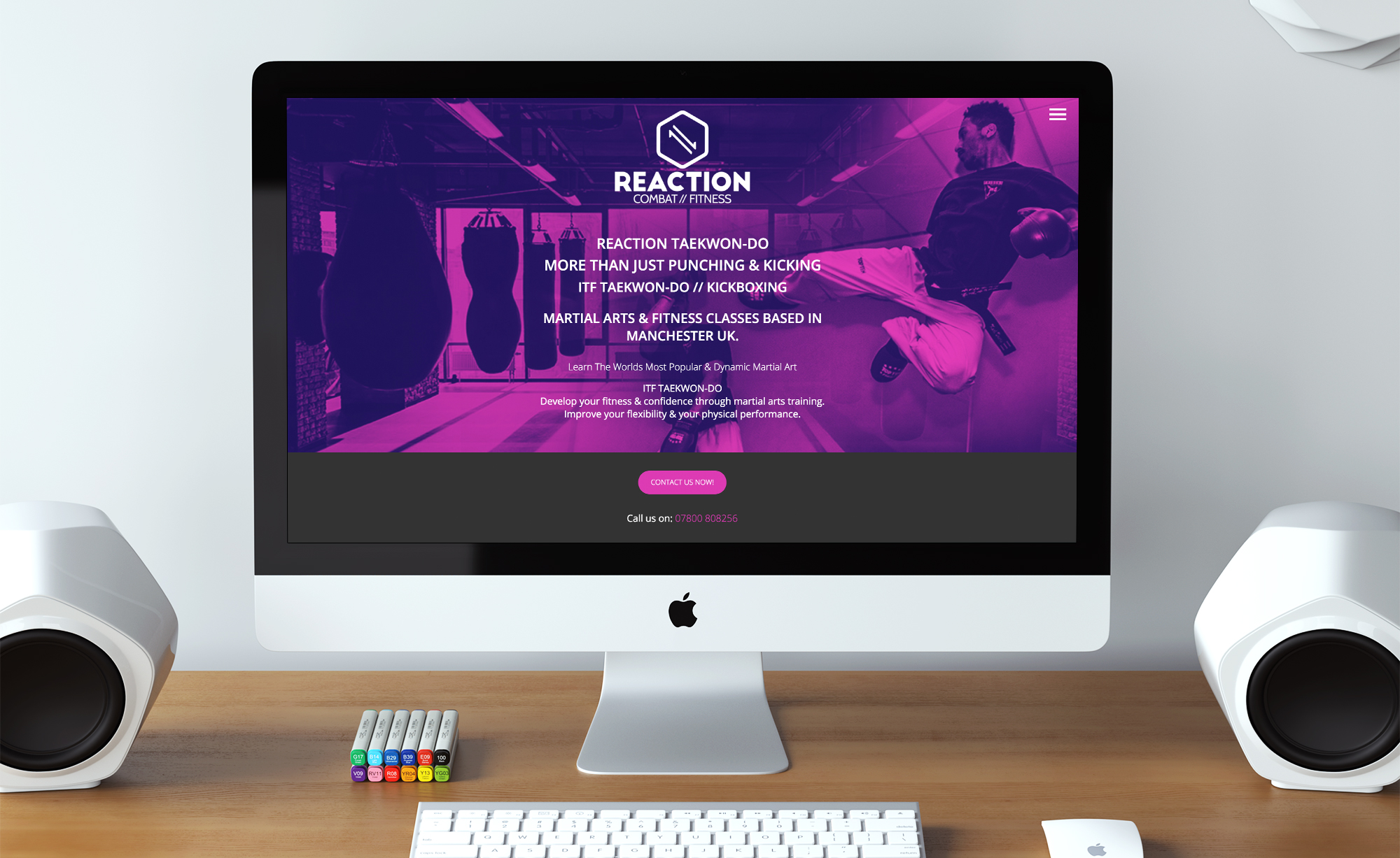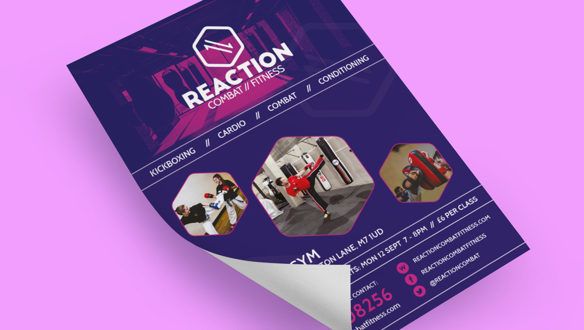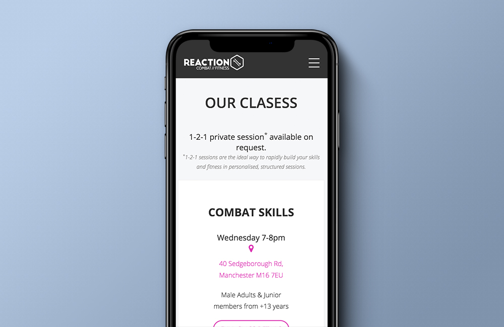
Reaction Combat Fitness
UX / UI Design / Branding / Custom Wordpress Theme
I was approached by Marc at Reaction Combat Fitness who required a brand identity and web presence for his now Combat Fitness school.
To establish an understanding of the business and the clients he worked with, time was spent interviewing, discussing with the instructor but also his potential customers to get a fuller understanding of their requirements moving forward.
This information was vital to have a clear picture of the demographics we were designing for and aiming our content at. This information also came into consideration for the new brand identity, as it widened the scope of competitor knowledge and customer expectations.


